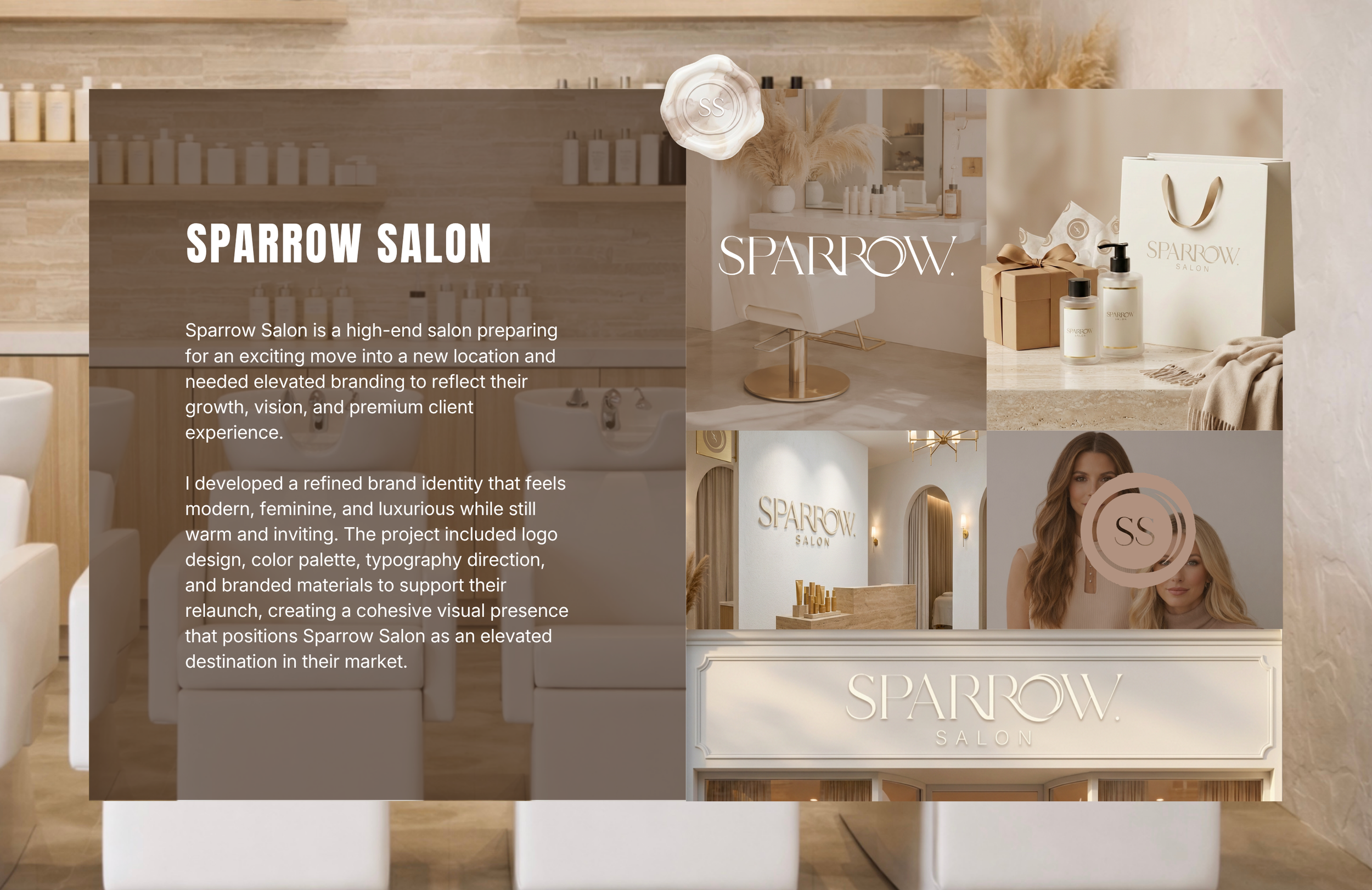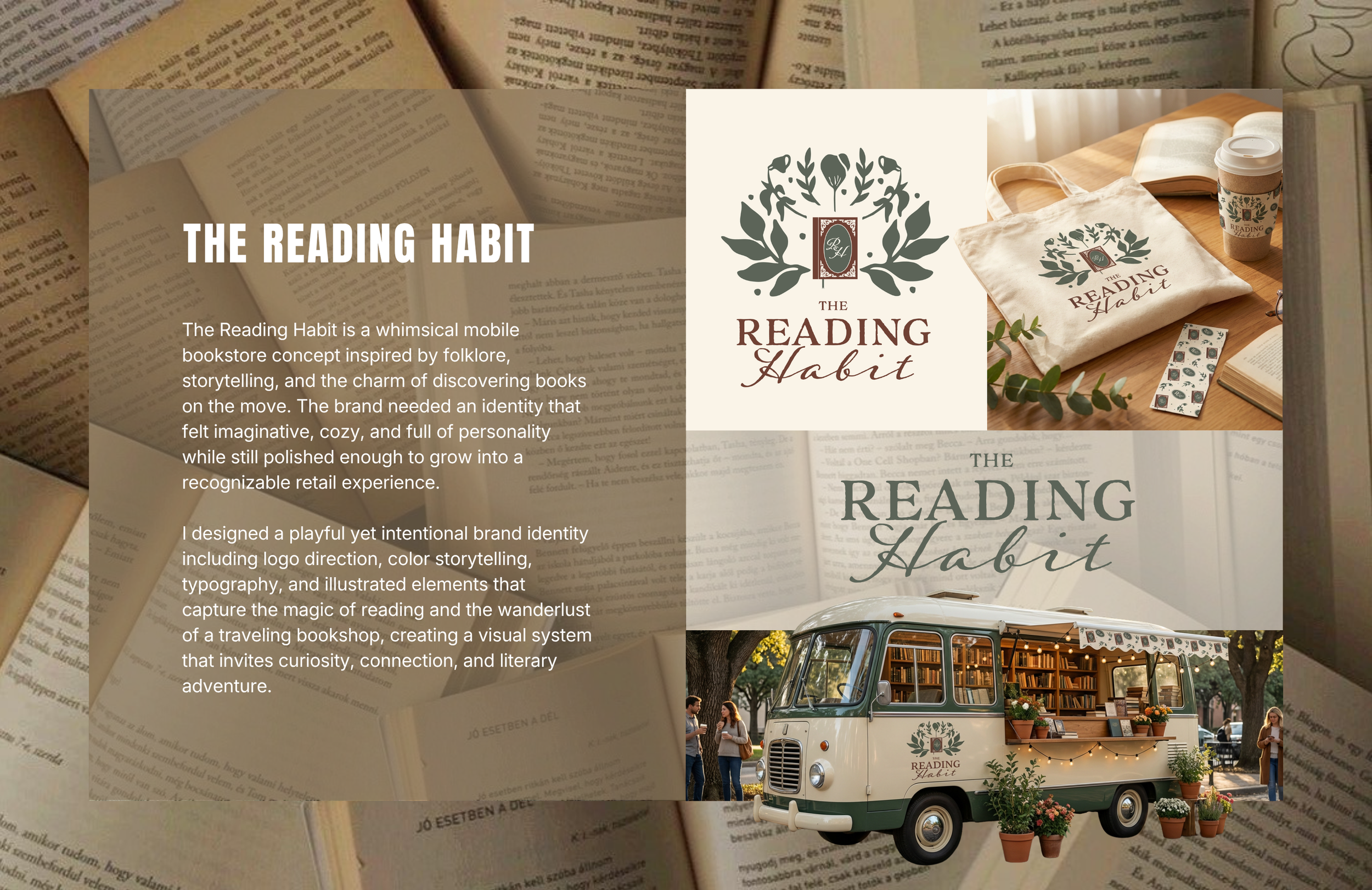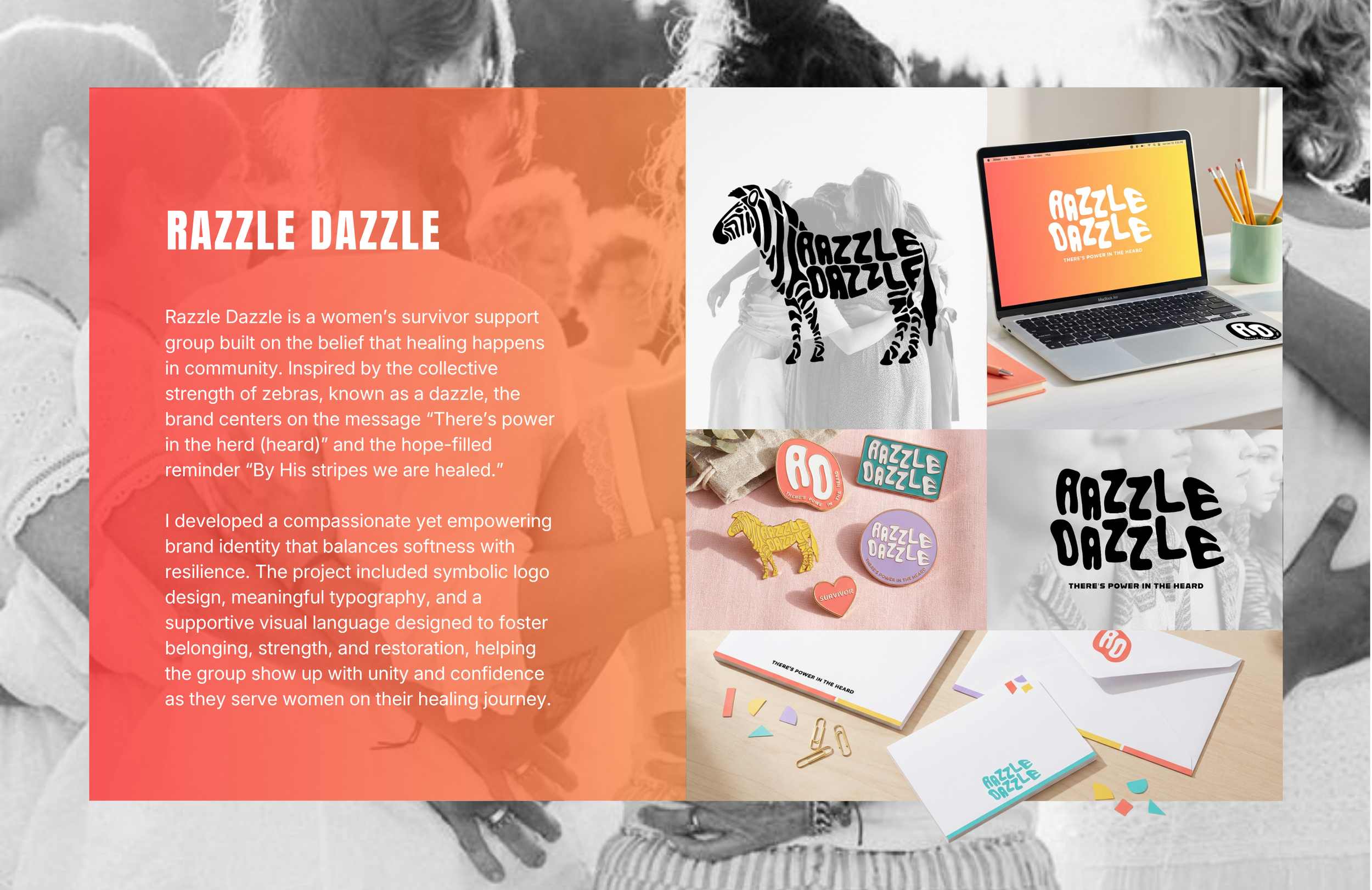
Let me show you how I design cohesive packaging systems that bring clarity, consistency, and shelf impact to growing brands.

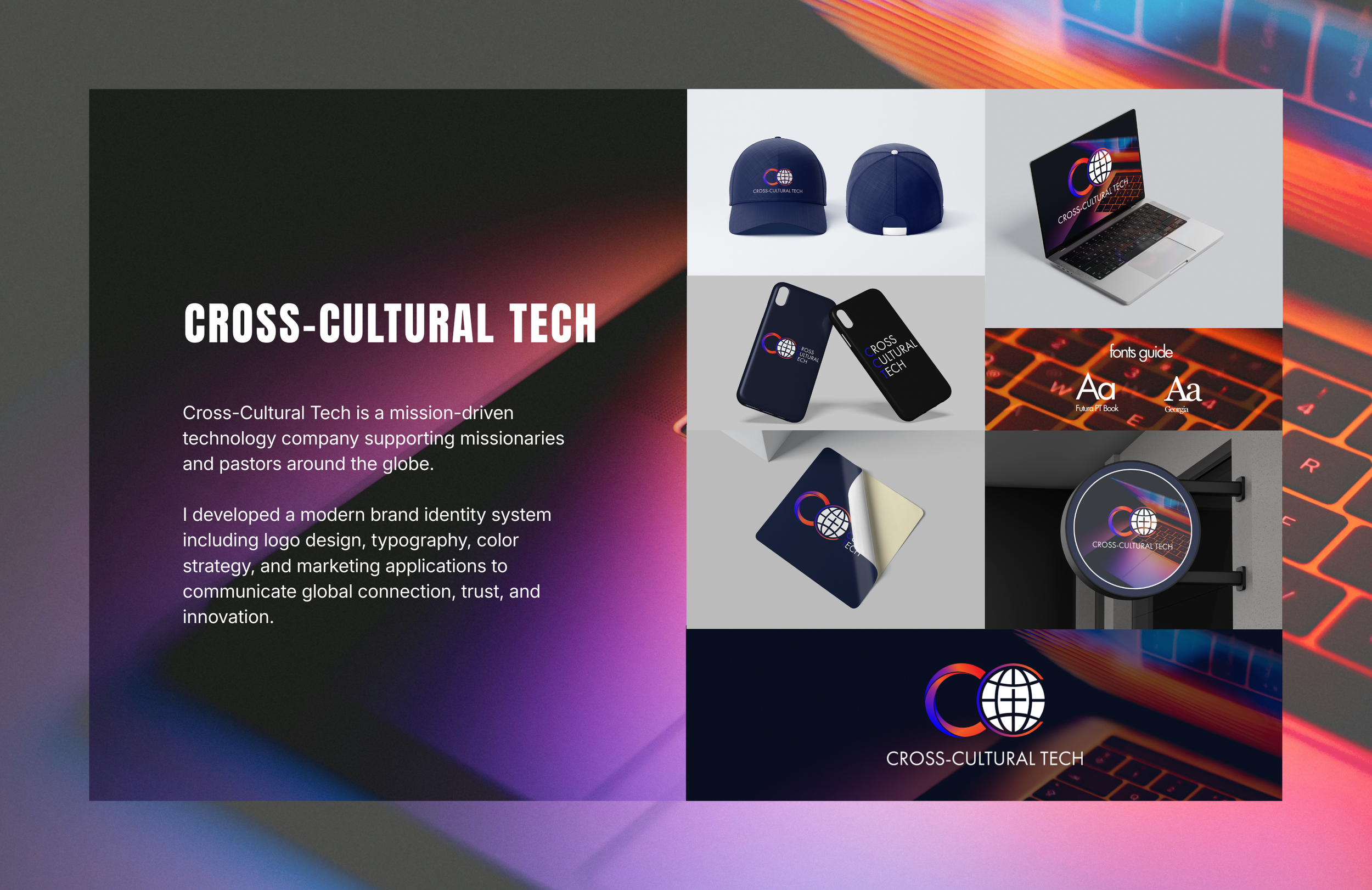
BOTANICAL PRODUCT LINE
PACKAGING DESIGN SYSTEM
This botanical wellness brand was experiencing rapid product growth and needed a packaging system that could support expansion while maintaining visual consistency. The goal was to elevate shelf presence, simplify label production, and create a recognizable brand experience across multiple product sizes and categories.
THE CHALLENGE
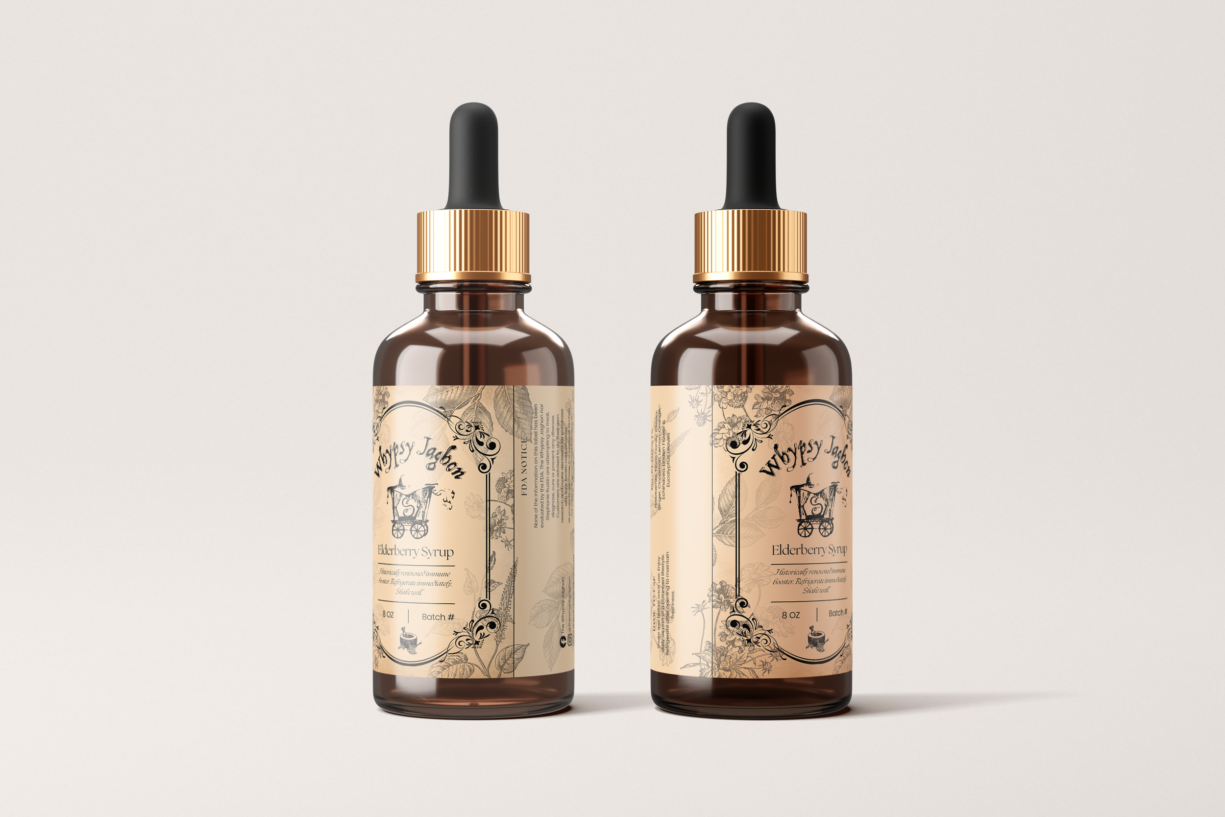
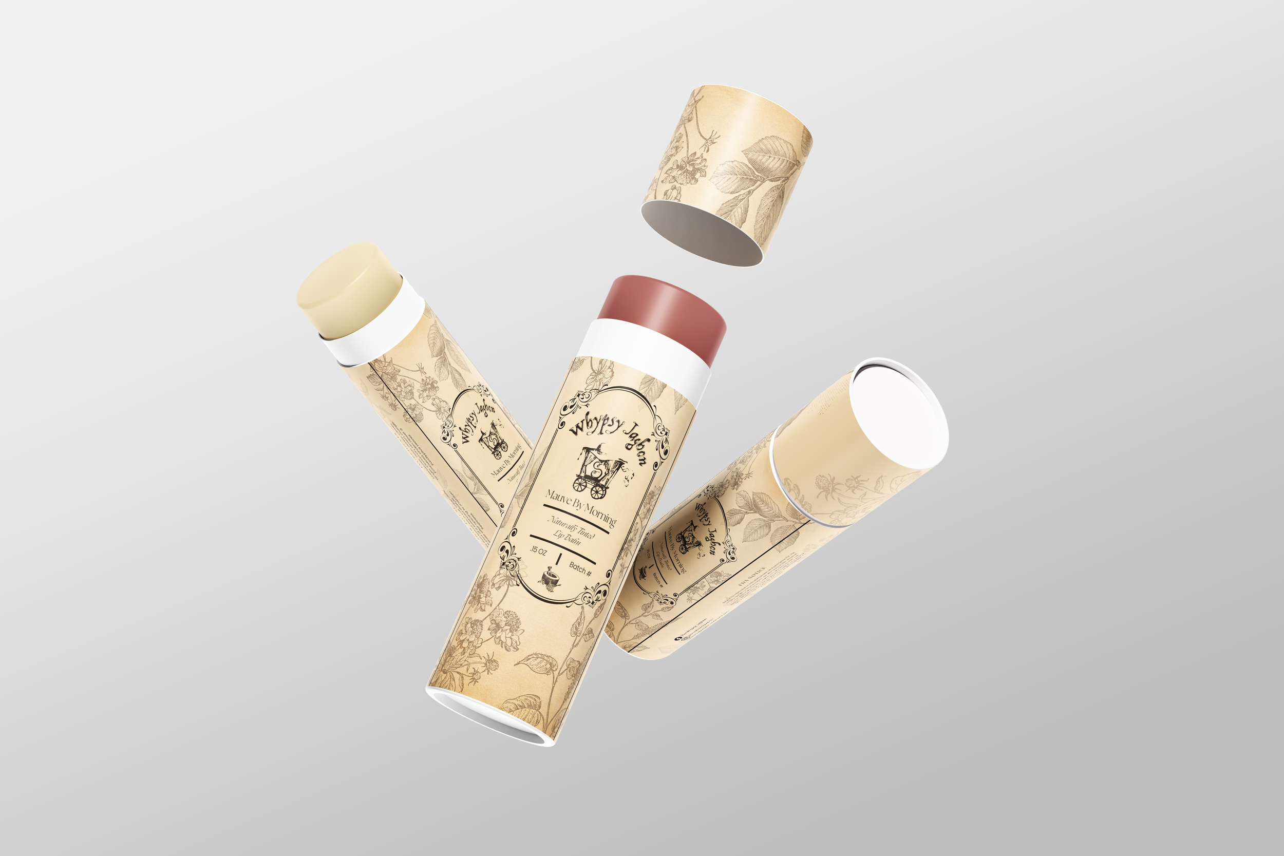
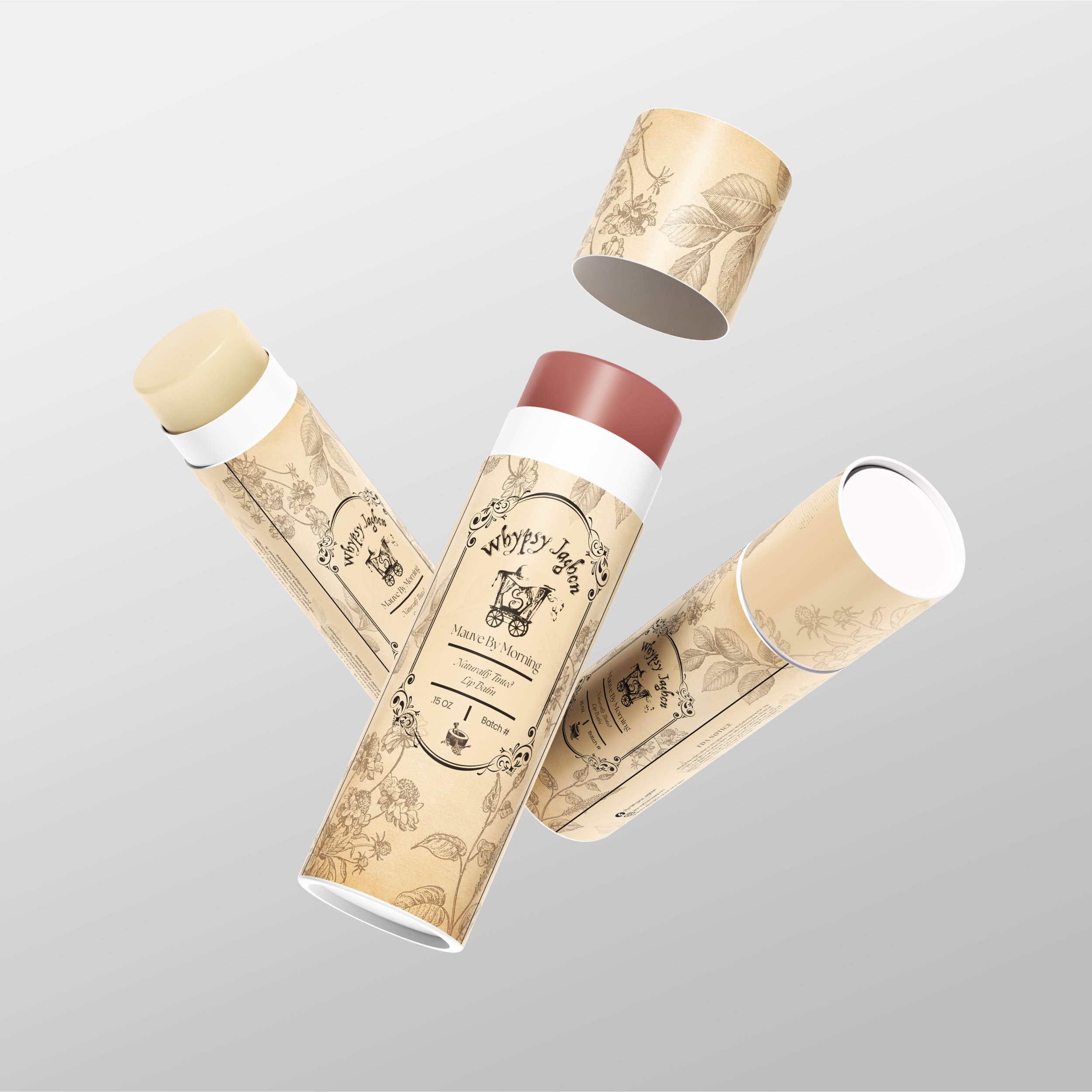
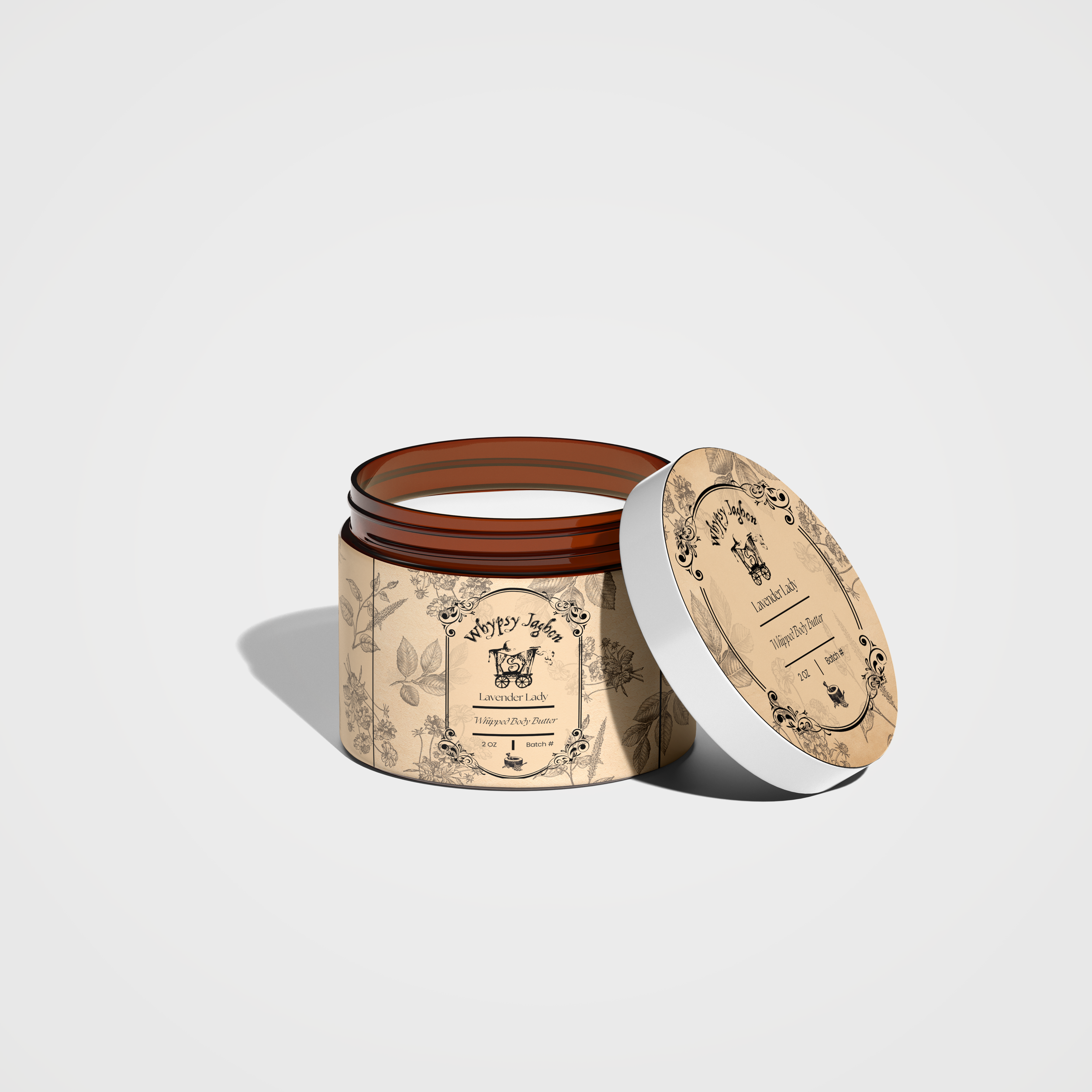
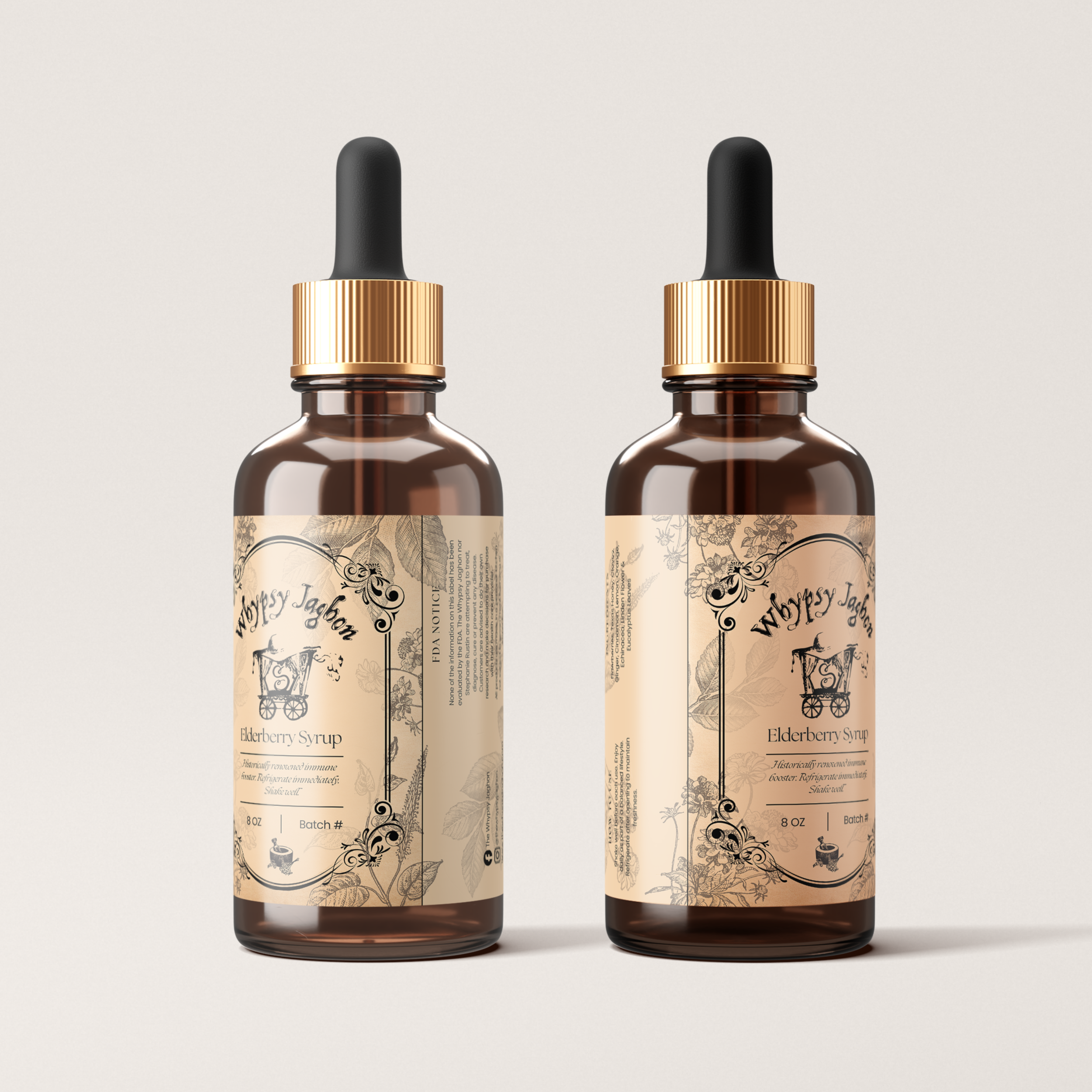
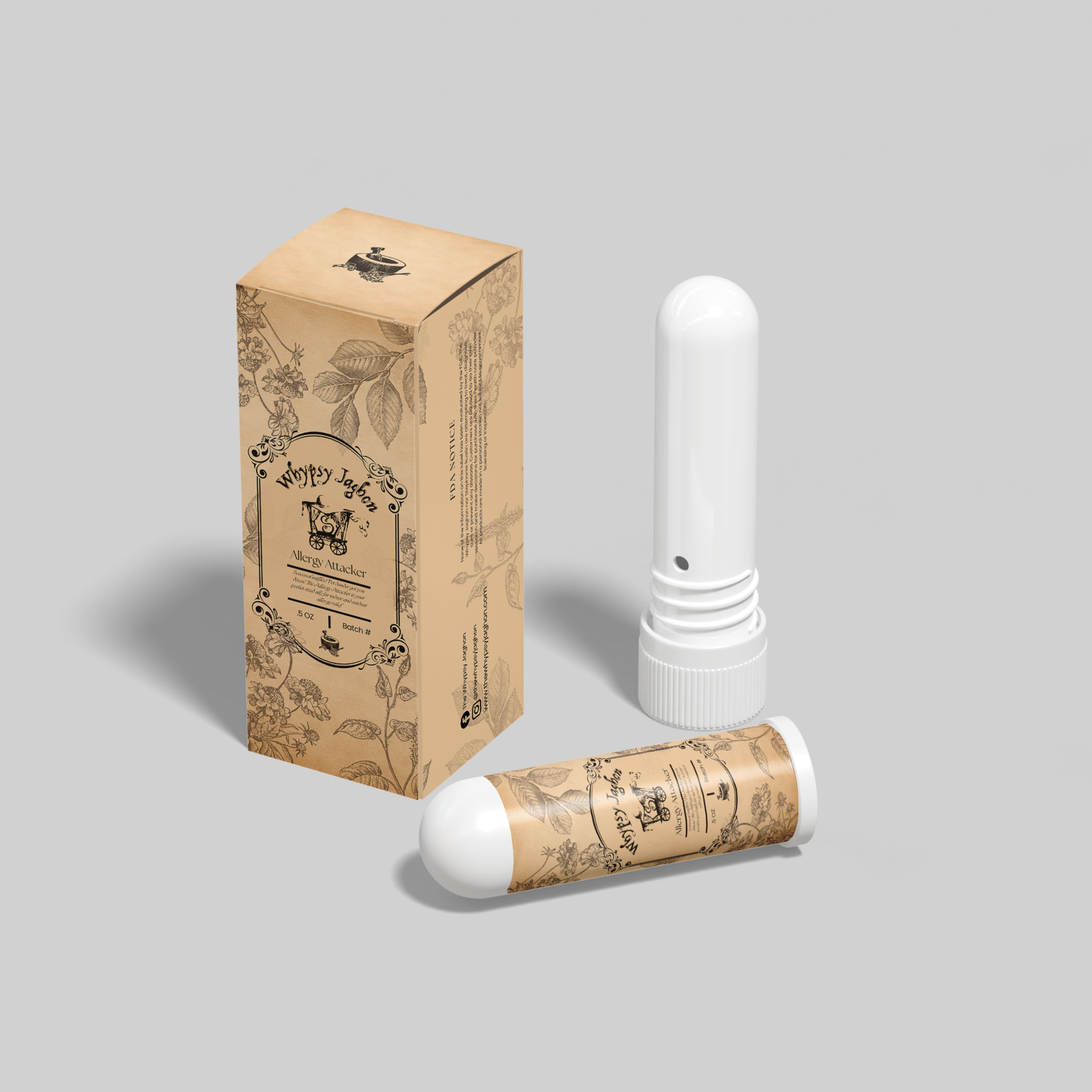
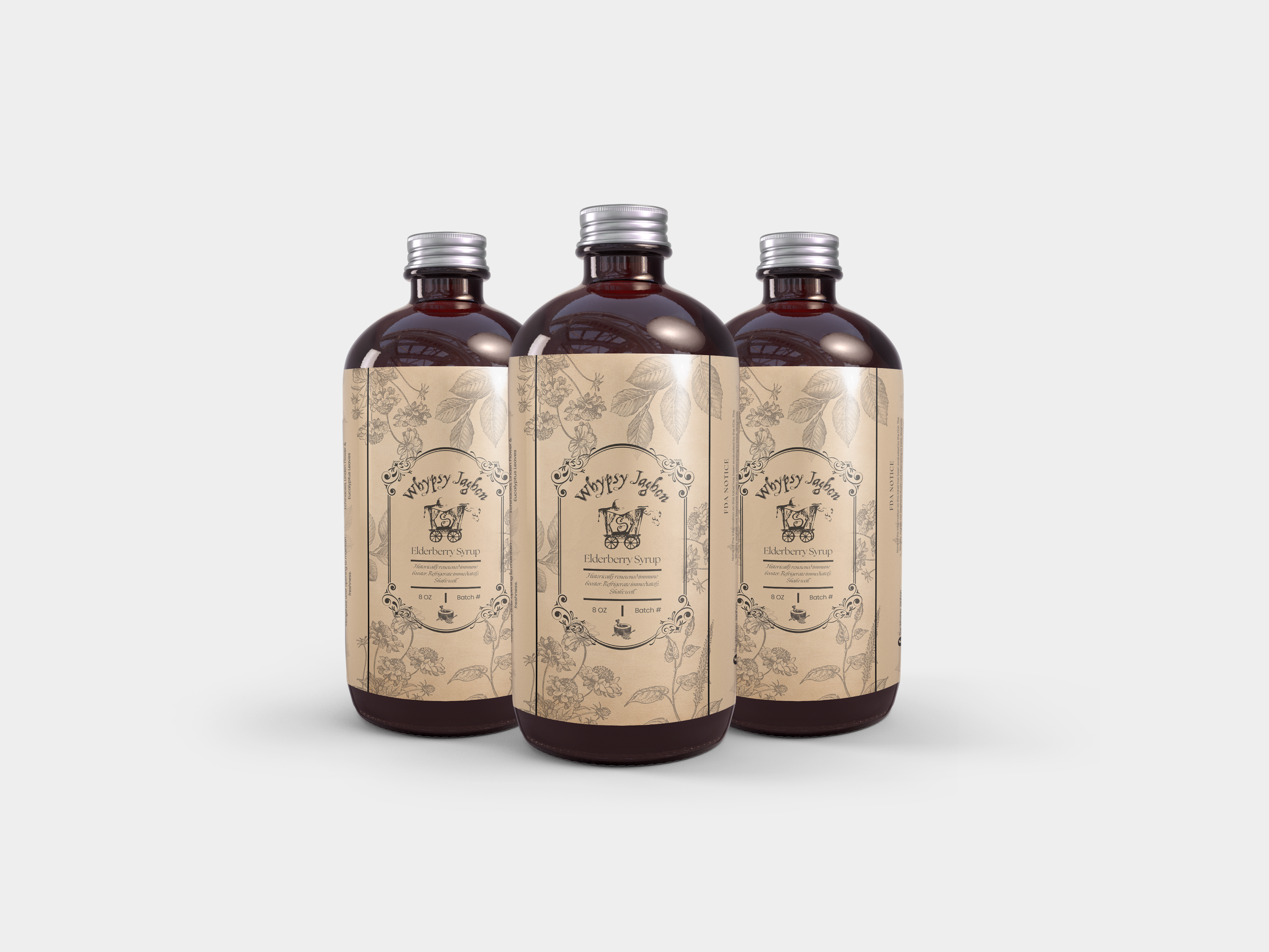
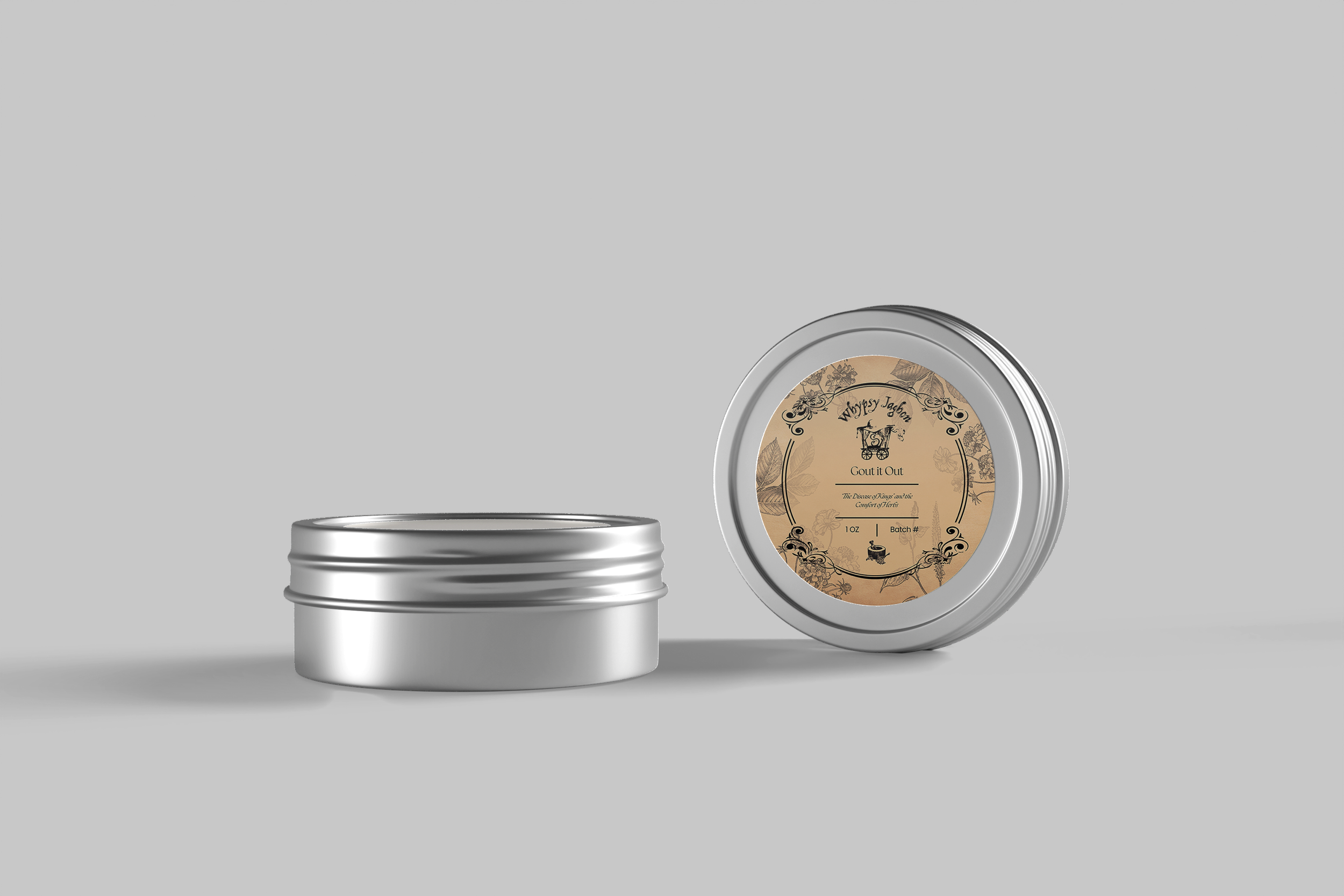
The brand offered a wide range of products — including rollers, jars, bottles, inhalers, and tea pouches — each requiring different label dimensions and information hierarchy. Existing packaging lacked standardization, making it difficult to scale production and maintain a cohesive look across the product line.
The solution needed to balance beauty with practicality, ensuring labels could be easily reproduced while still communicating quality and trust.
MY PROCESS
I began by auditing the full product lineup to understand packaging variations, usage environments, and customer touchpoints. From there, I developed a structured label hierarchy that defined typography scale, spacing rhythm, and visual weight for ingredients, product names, and brand marks.
I created adaptable label templates that could be resized across multiple formats without compromising readability or brand integrity. Color direction and subtle decorative elements were introduced to help customers quickly distinguish product categories while preserving a unified brand presence.

DESIGN SYSTEM
The final packaging system included:
Standardized label templates for multiple product sizes
Typography hierarchy for clear product communication
Cohesive color strategy for product differentiation
Brand pattern and decorative elements
Production-ready files for both short-run and large-scale printing
The system was designed to streamline workflows while enhancing shelf appeal and customer recognition.
OUTCOME
The new packaging identity gave the brand a polished and professional presence across markets and events. By introducing structure and scalability, the business was able to expand its product offerings with confidence while maintaining a consistent and memorable visual experience.
This project reflects my approach to packaging design — combining brand storytelling, practical production thinking, and system-driven execution.
FEATURED WORK