Let me walk you through how I launch a brand identity from concept to completion.
RAZZLE DAZZLE
FULL BRAND IDENTITY LAUNCH
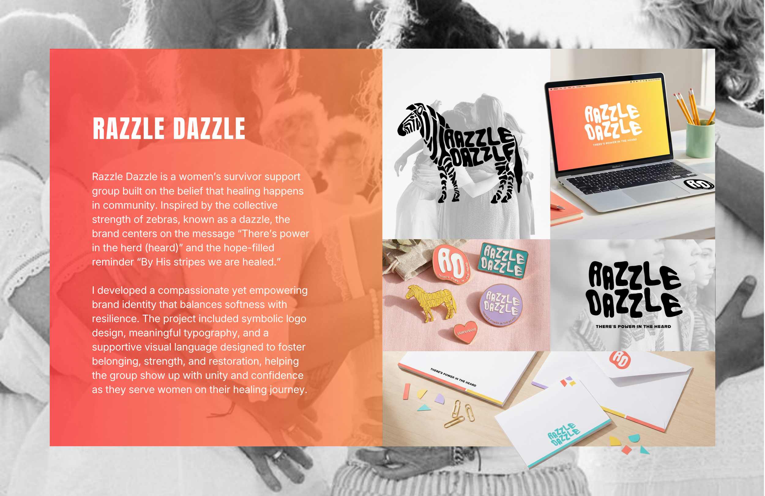
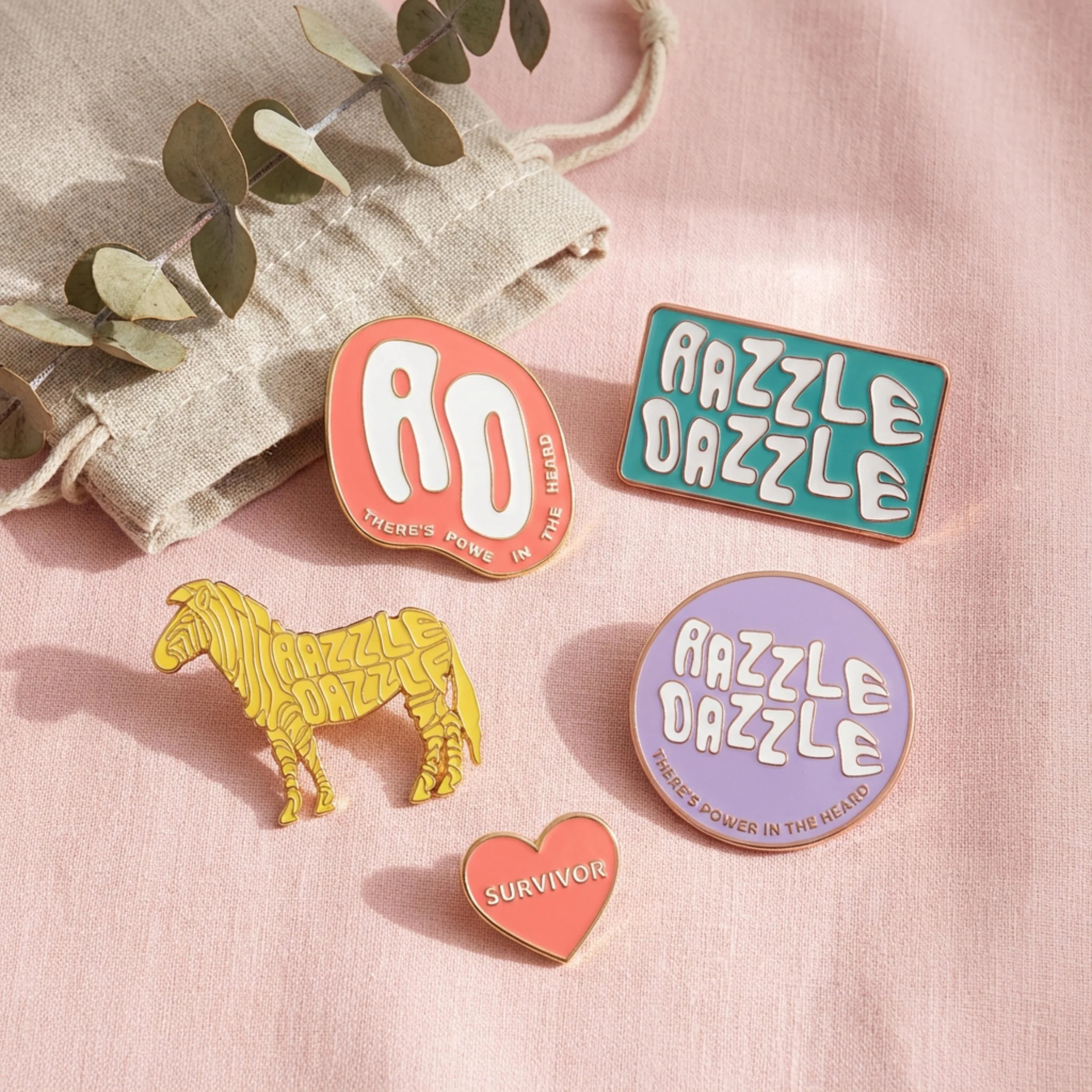
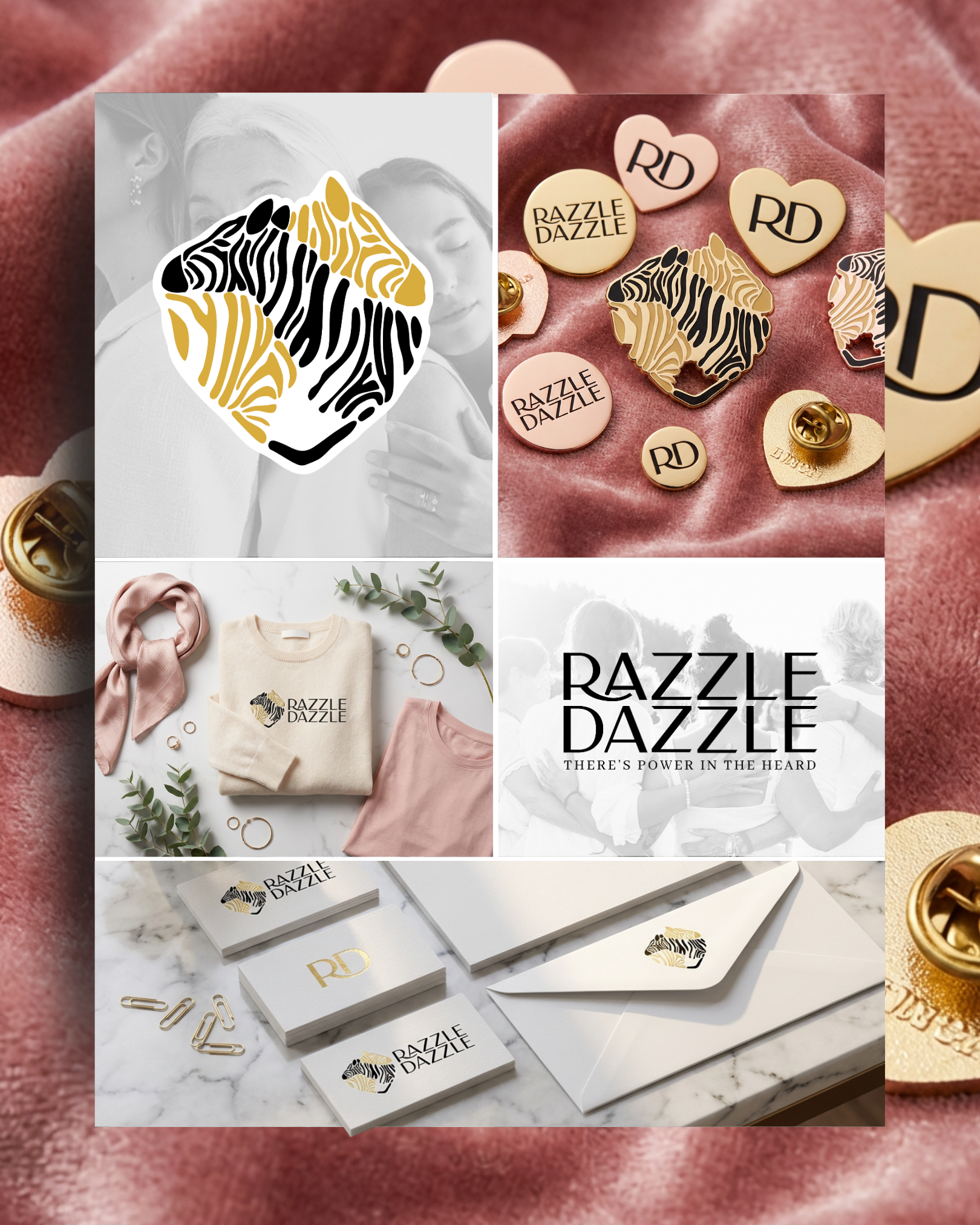
Razzle Dazzle is a women’s survivor support group founded by Meghan, created to provide a safe and empowering space for healing, connection, and shared strength. The organization’s messaging is rooted in the belief that there is power in community — inspired by the term “dazzle,” which refers to a group of zebras — along with the hope-filled reminder, “By His stripes we are healed.”
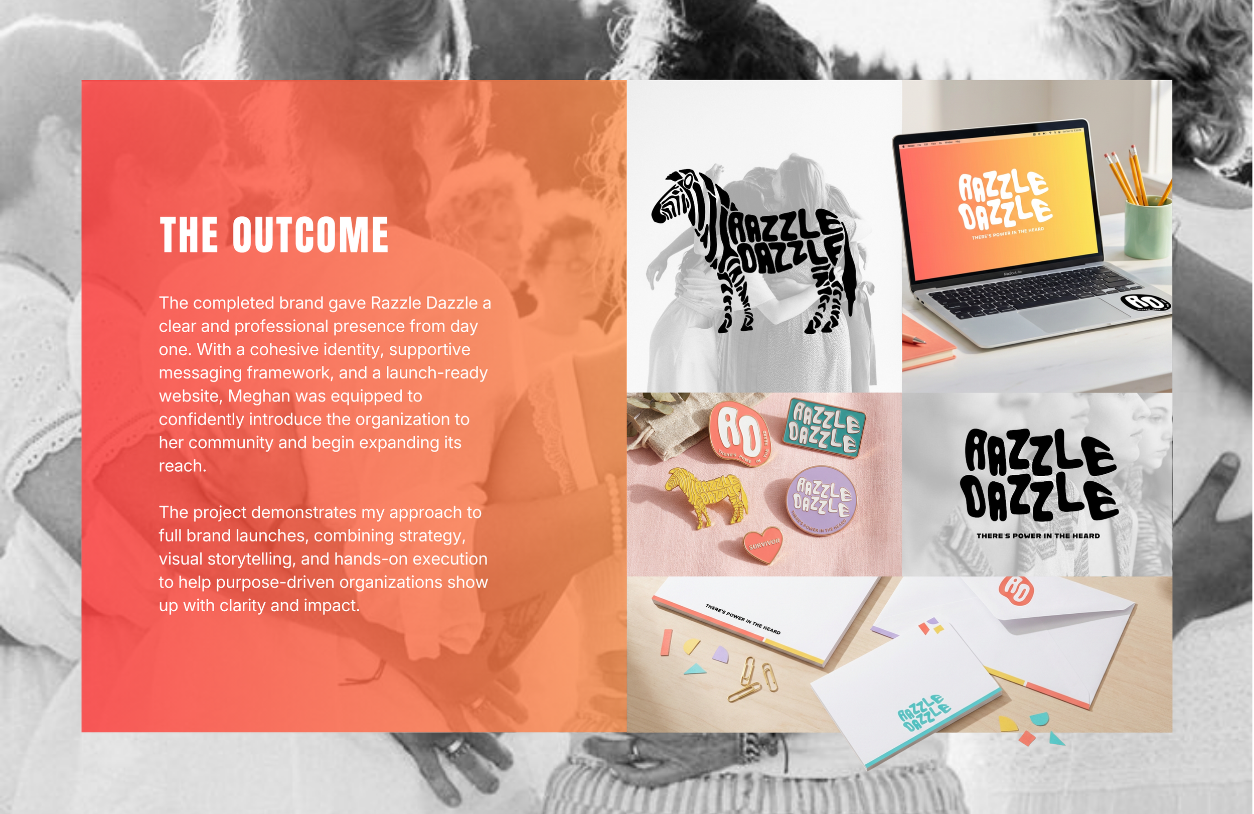
Meghan came to me needing more than just a logo. She needed a brand that could carry deep emotional meaning while still feeling welcoming, uplifting, and strong. The goal was to develop a cohesive identity that would help the organization show up with clarity, confidence, and unity as it began reaching and supporting more women.
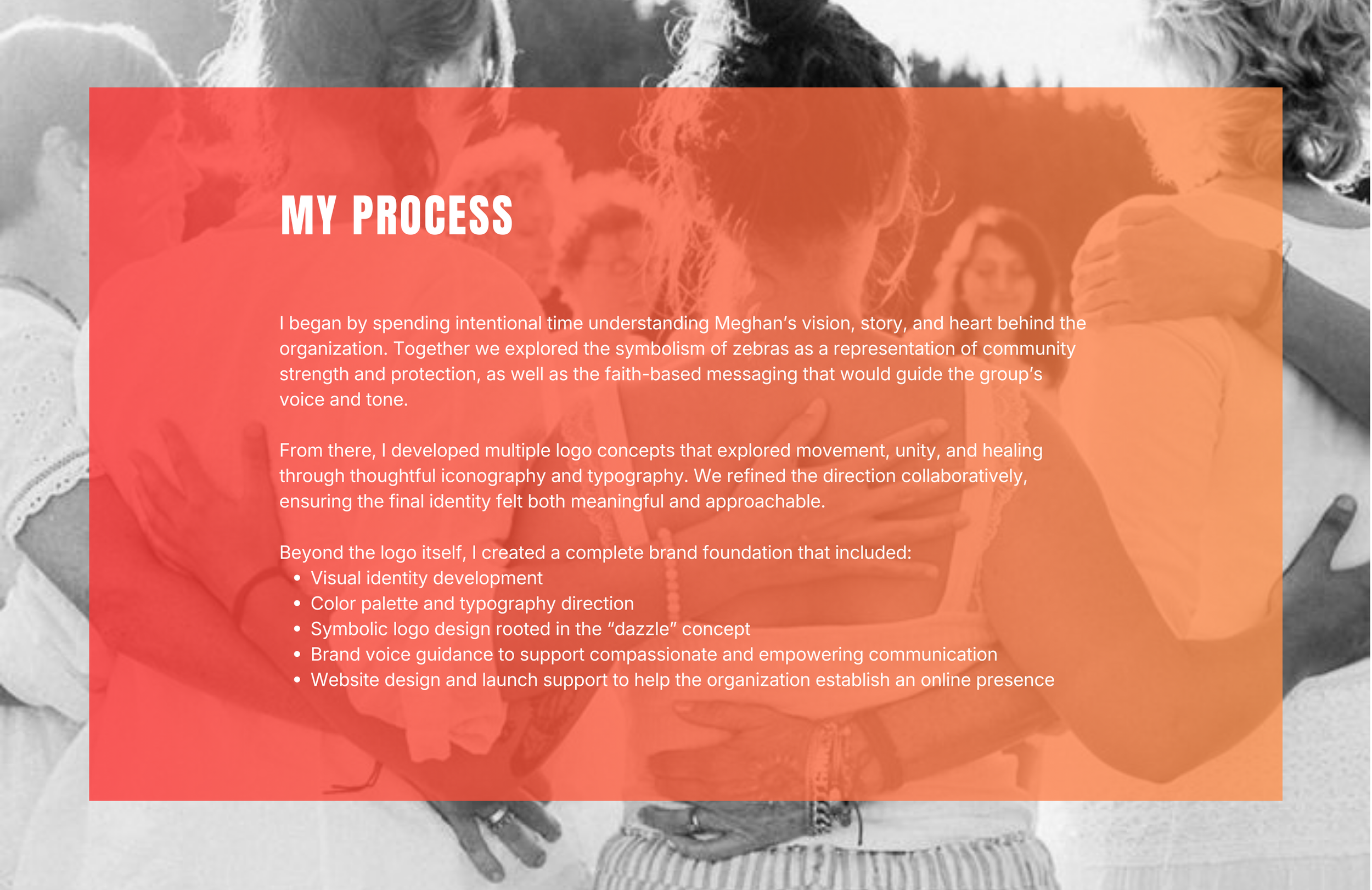
THE CHALLENGE
Because Razzle Dazzle is built around sensitive and deeply personal experiences, the visual identity needed to balance compassion with empowerment. The brand had to feel safe and supportive while also communicating resilience, hope, and forward movement.
In addition to emotional considerations, Meghan also needed a full launch-ready system — including messaging direction and a website presence — so the group could grow its visibility and accessibility.
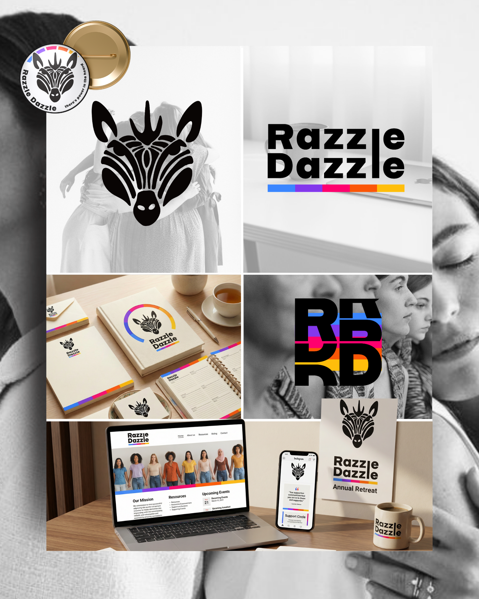
MEGHAN’S THREE OPTIONS
DESIGN DIRECTION
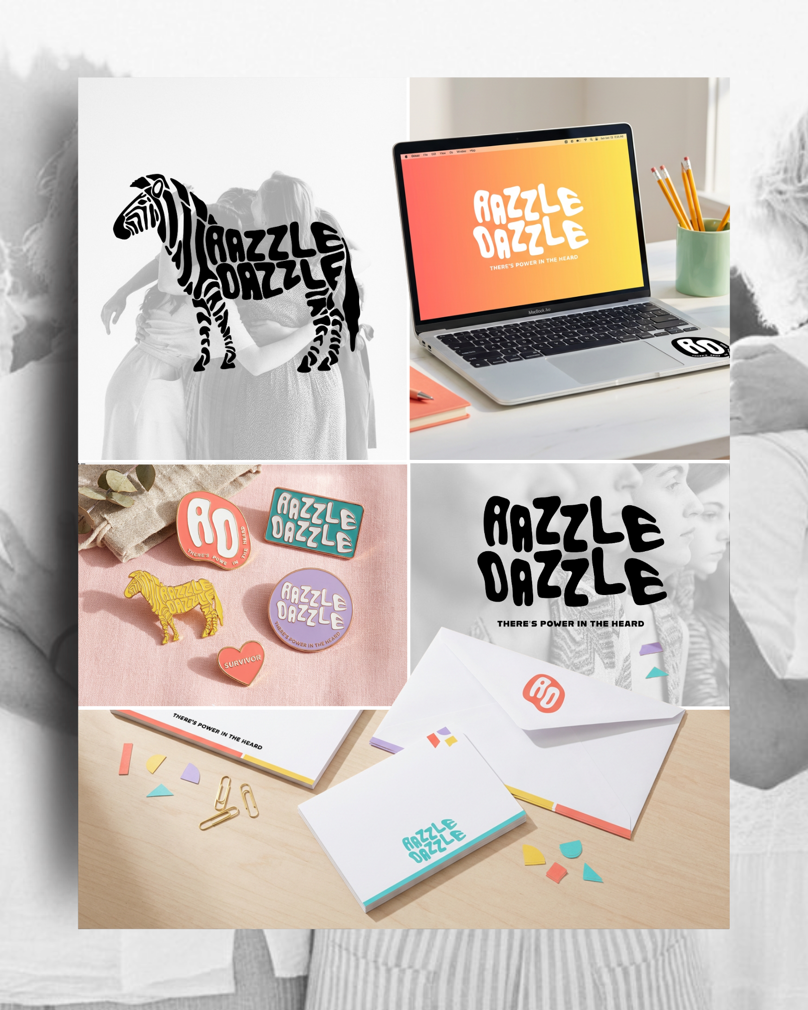
The final brand identity blends softness with strength through balanced typography, intentional spacing, and symbolic graphic elements. The visual language was designed to feel warm and inviting while still communicating confidence and unity.
Every design decision supported Meghan’s mission: helping women feel seen, heard, and supported as they walk through their healing journey together.
FEATURED WORK